EVOKE
Web and Brand design for Research Lab
Overview
EVOKE Lab is a renowned lab known for its outstanding work with integrating and utilizing data and technology into social-rooted discourses.
On top of being a research assistant, I also served as the lone web designer, playing a key role in redesigning and organizing their WordPress site and modernizing their brand guidelines.
Role
Web Designer
Research Assistant
Duration
Jan. 2021 - Jul. 2022
Team
Principal Investigator: Roderic C.
Doctoral Researchers: Bono O, Lucy P., Nneka O.
Research Asst.: Miguel H.
Pain Points
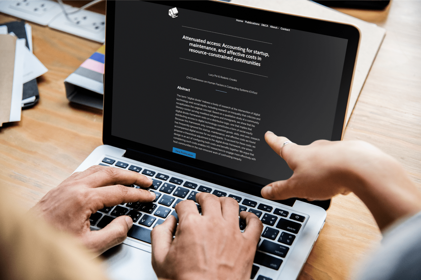
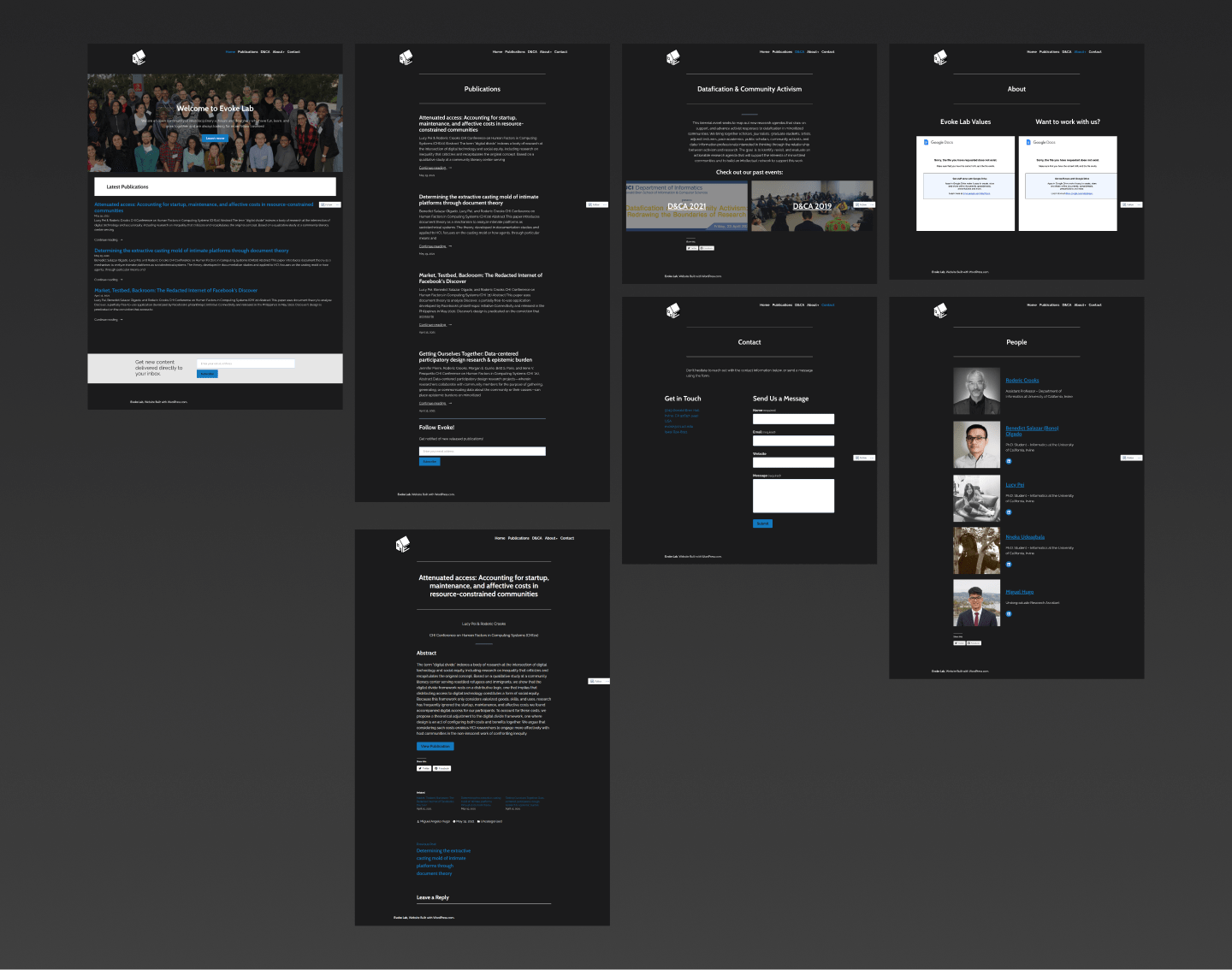
The previous iteration of the website was outdated and in need of a major revamp. My focus lied with determining how to modernize the branding, organize content in a visually appealing manner, and improve the overall user experience.
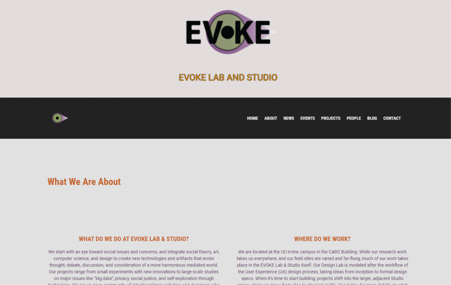
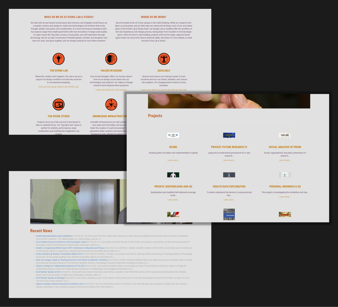
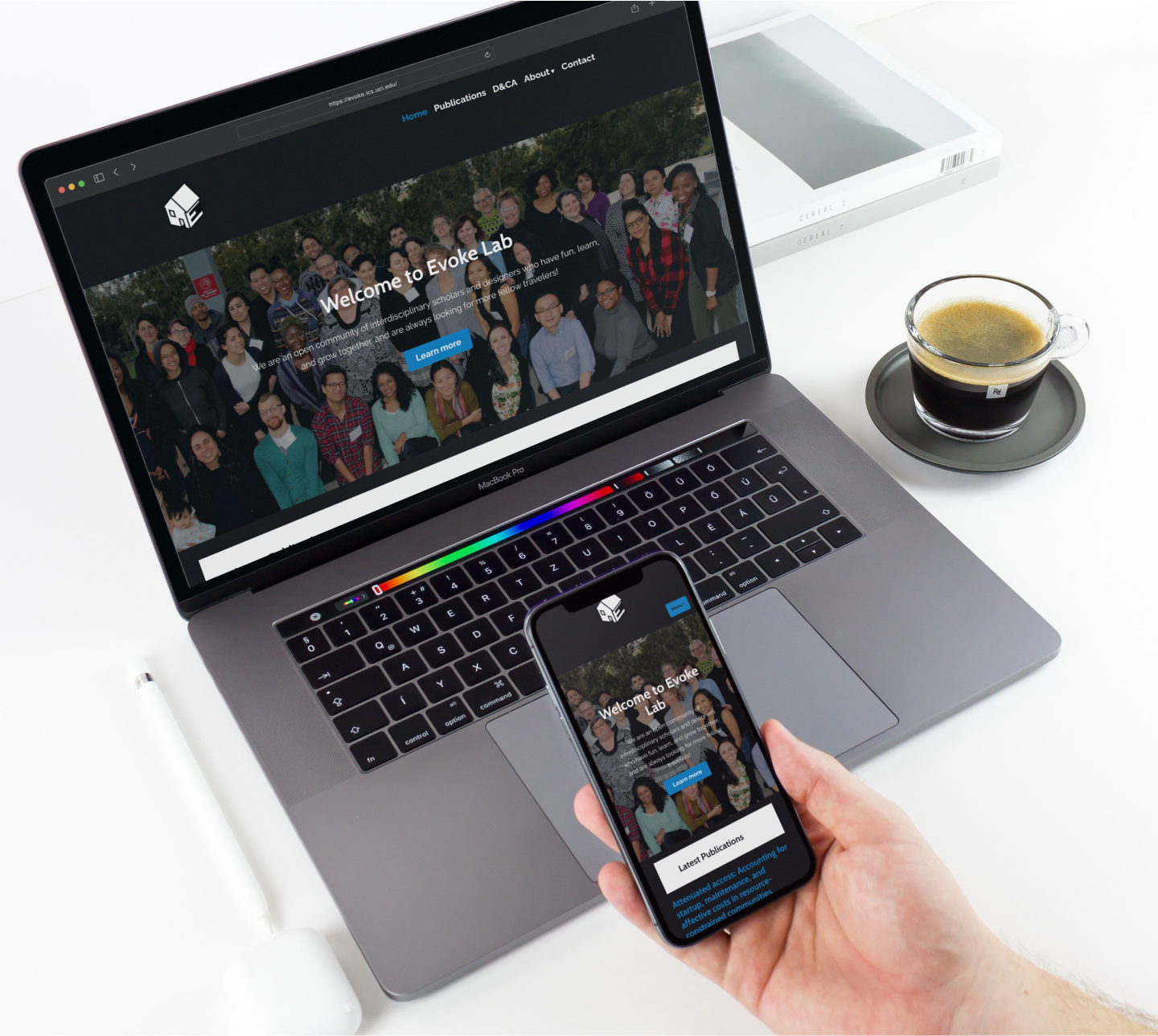
Long Scroll Site. Having users scroll through long websites can lead to “scrolling fatigue”, which affects likelihood to stay on the site. Navigation should be focused on segmenting different sections to their own page.
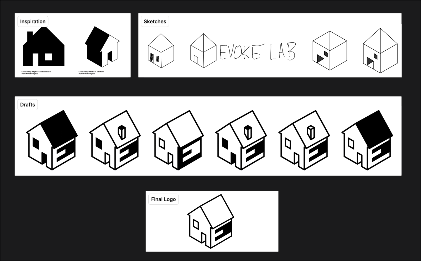
Branding
First step in modernizing the site is by modernizing the visual guideline of the lab as a whole. The question I asked myself is “How do we create a look that corresponds to the current state of the lab and its values?”
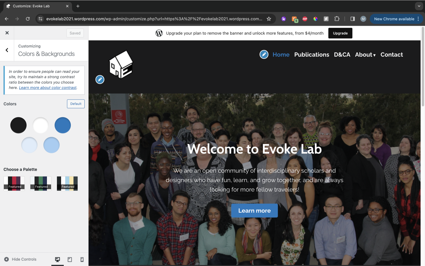
Website Build
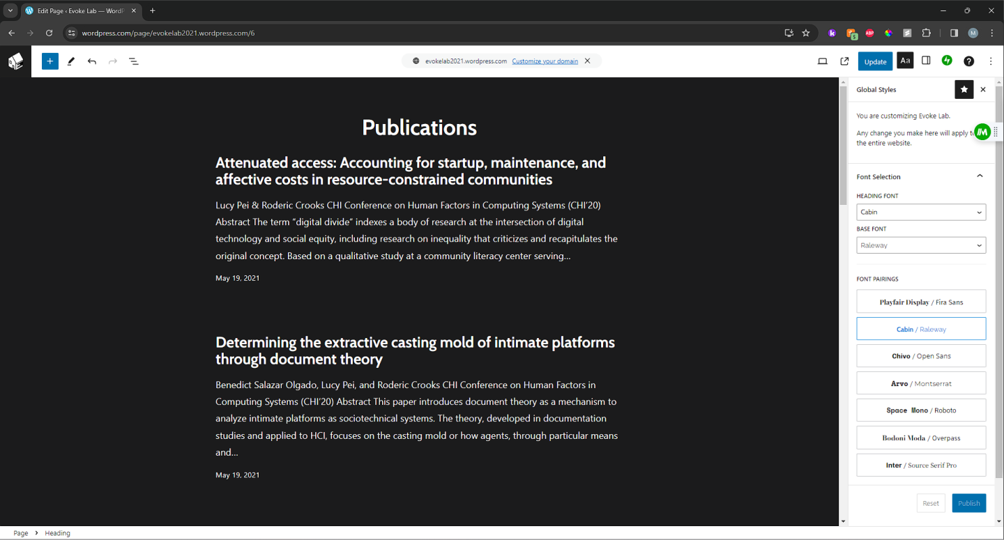
Redesigning the site and its content to comply to the lab’s current foci, alongside adapting the branding language. The current iteration of the lab required more of a focus on its publications and less on projects, news, and events.