EnCiv

Designing to Develop Democratic Discourse

Overview

EnCiv is a non-profit dedicated to creating digital tools to enhance democratic discourse on community issues.

My role within EnCiv was to help redesign the website to cater to a larger audience and boost engagement for the organization's tools.

Role

UI/UX Designer

Duration

Jun. 2023 - Present

Team

CEO/CTO: David F.

Designers: Orchid C., Miguel H.

Pain Points

The existing EnCiv website was in need of a major revamp, as it had been created without the eyes of a designer. I set out to spot the major areas of improvement that can be solved with a redesign.

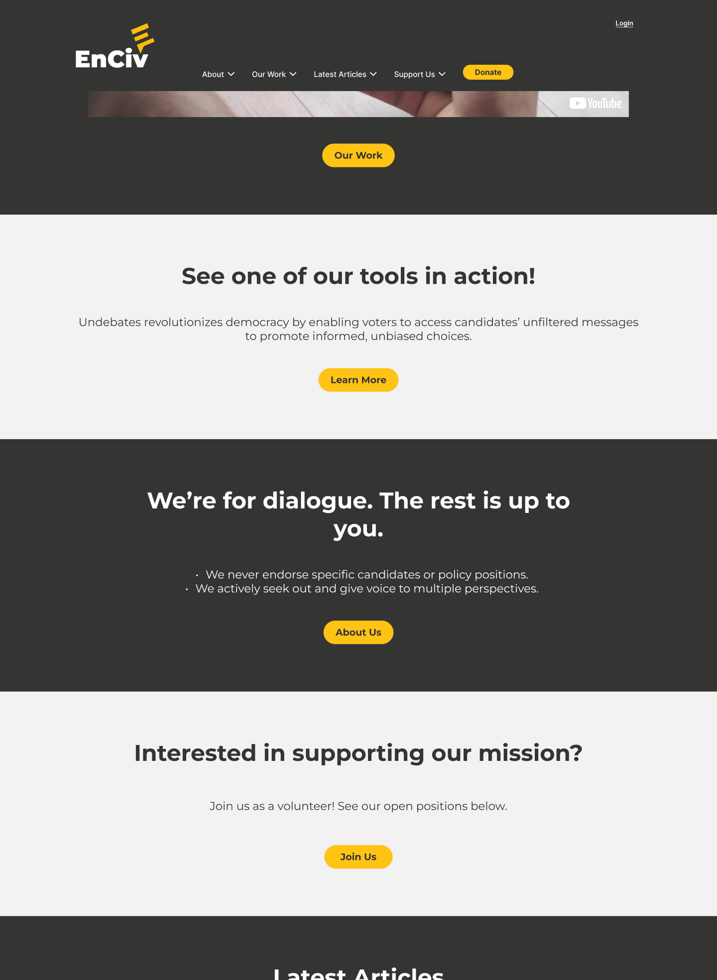
Lack of visual appeal. The landing page, like much of the other pages, had a very barebones build, containing little-to-no visual details. A chunk of this problem can also be attributed to a deficiency in a consistent visual branding language being applied to the site.
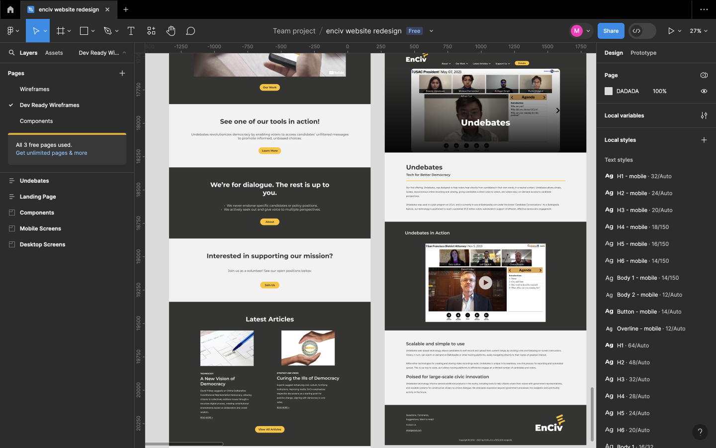
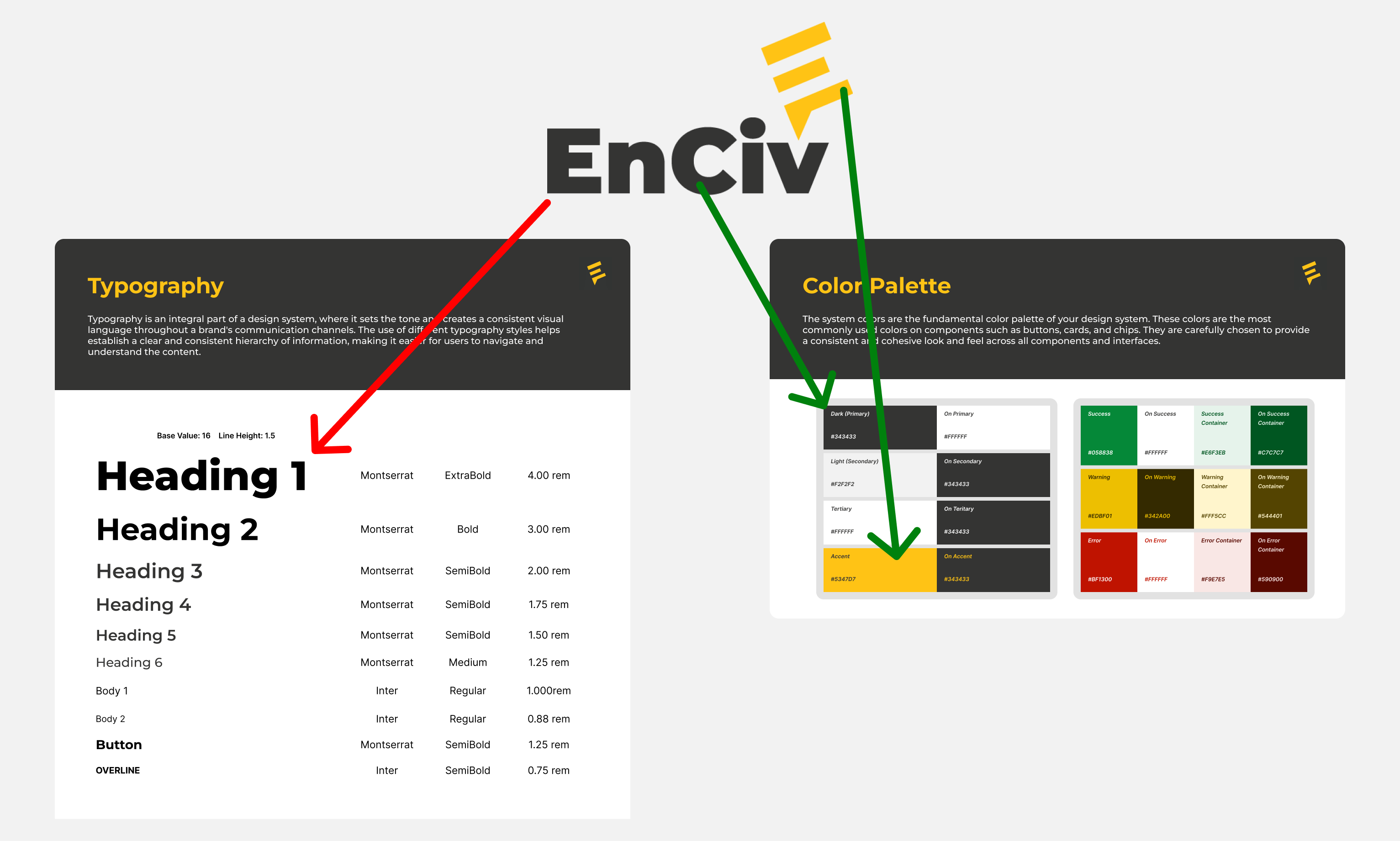
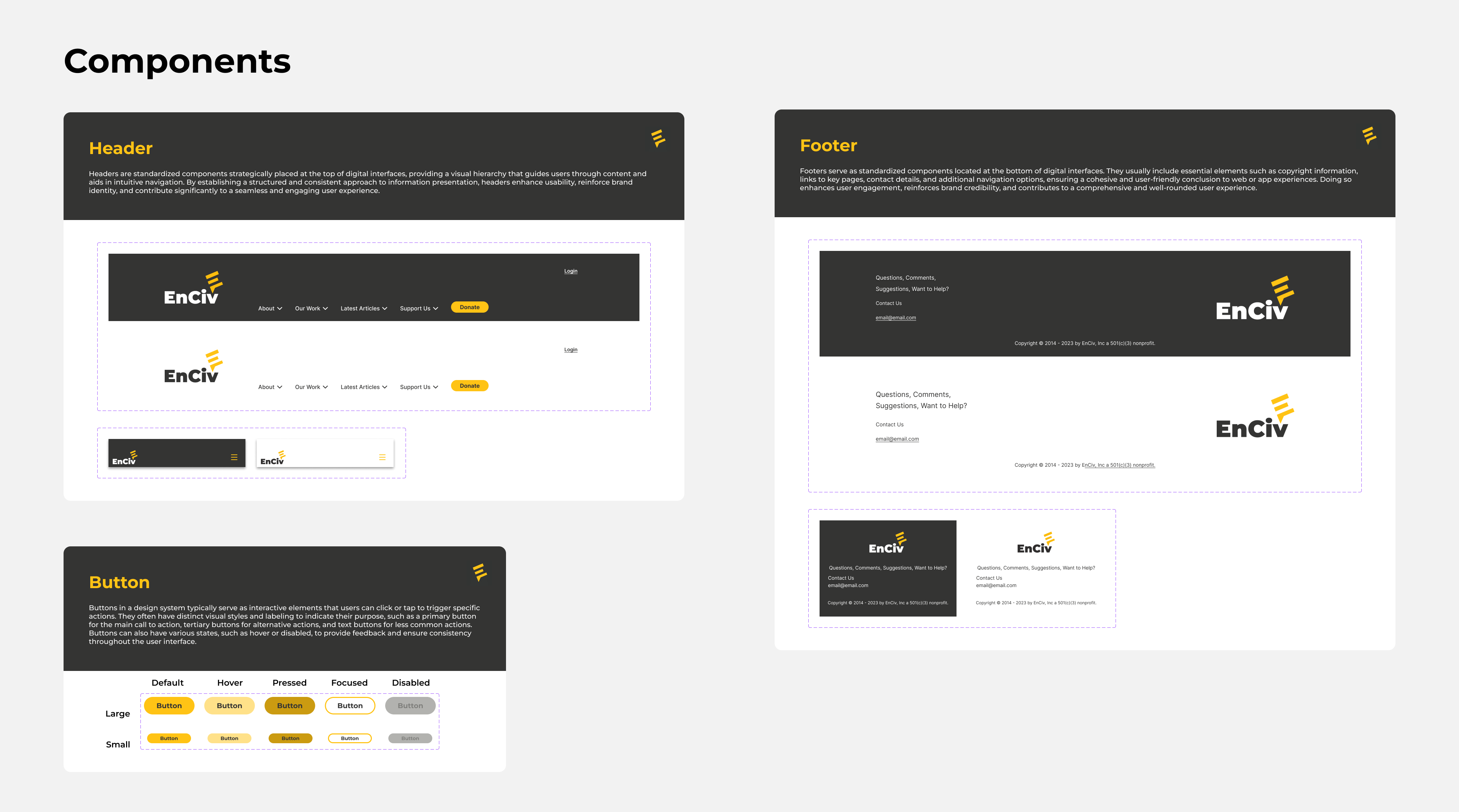
Poor contrast. A lot of the content in these text-heavy pages did not meet basic AA contrast standards, including text, CTAs, and other visual elements.
Lack of cohesive, organized UX. It becomes difficult for the user to understand the most important information to absorb due to inconsistent UX elements, like visual hierarchy, poor content delivery, etc.

Design System

I made the lack of a consistent visual language the first problem to tackle with the redesign. To do so, I created a design system by re-engineering visual elements that had already been utilized on the original site.
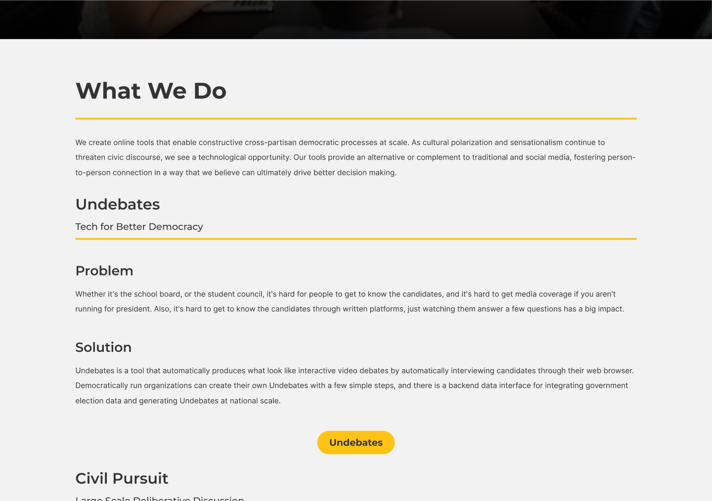
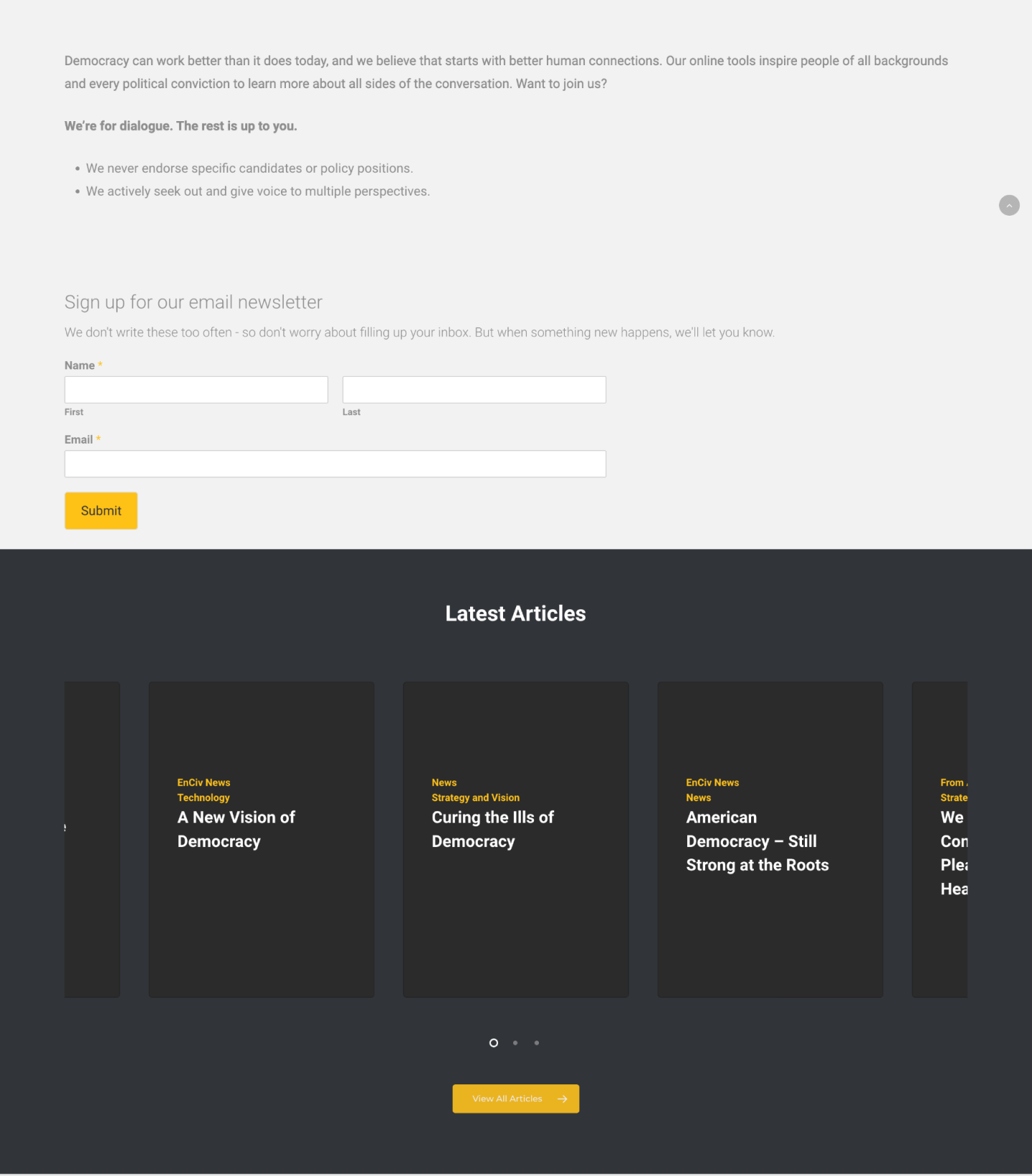
Logo as the main inspiration. Utilized the existing logo as the main inspiration behind the style guide. The logo font is used as the main typeface for headers and the colors of the wordmark and symbol serve as the primary and accent colors, respectively.
Components. Redesigned the main interactive components for the site, which includes the header, footer, and buttons. The priority was to have a modern look that upholds brand standards without sacrificing functional user experience.

Content Redesign

After solidifying visual language, the next step was to manage how content was to be displayed in a manner that is readable, organized, and above all, accessible.

Content blocks. The main way I organized content was to use blocks to sectionalize content that had served different purposes or conveyed different info. Doing so not only helped increase readability and increase contrast, but allowed an adaptation of our visual language onto the site.
Improved visual hierarchy. Utilizing the new type chart and heading configuration to enhance readability of text-heavy content. Contrast of many elements has also been fixed in this process.
Clearer CTAs. Visual improvements have been made for the buttons and nav menu to allow for easier and logical navigation between pages. The corresponding text also betters user understanding of where they will be taken to.