Compass

Data tool for Special Education classes

Overview

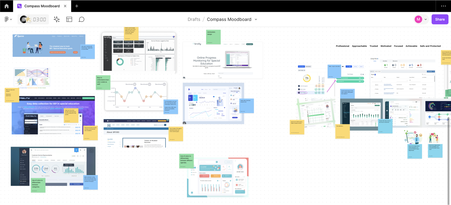
A SF Civic Tech project, Project Compass innovates special education with a user-friendly web app, revolutionizing data collection and analysis for educators, ensuring accurate student progress tracking and personalized support.

As a lead designer, I played a key role in building towards the MVP by spearheading product branding, crafting a visual language through our design system, and bringing our flows to life with wireframes.

Role

Lead UX Designer

Duration

Oct. 2022 - Present

Team

Design: Tyler M. (Lead), Miguel H. (Lead), Neha A., Cory I.


PM: Niko B. (Founder), Mao M., Janice T.
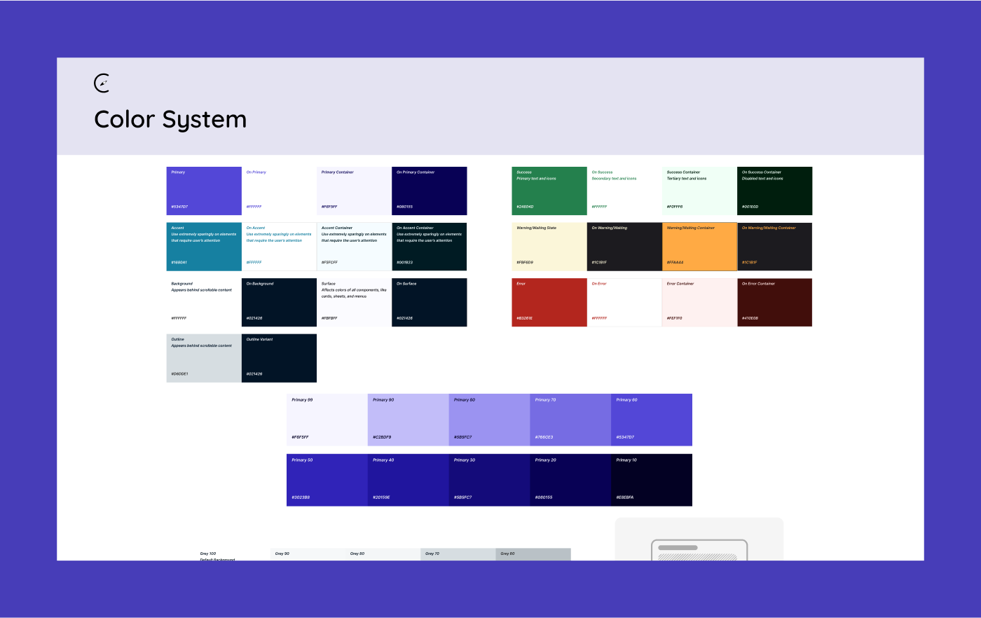
Branding

Crafted the branding language for the product through industry, user, and visual-related research. My specific focus lied with the logo and type system, while the color palette was a collaborative effort undergone by my team.
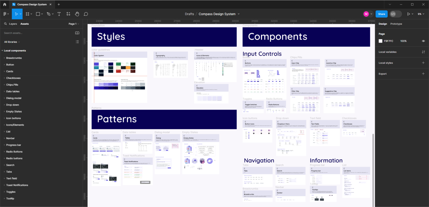
Branding Workspace. Illustrating the different variations and inspirations taken throughout the logo creation journey, including considerations for typography.
Final Typography Chart. The star of the show, “Quicksand”, serving as the main font, seen applied to different screen breakpoints and on the product wordmark, seamlessly integrating with the logo.
Final logo (in black and white). Focused on a minimalist compass imagery, while incorporating an educational element through the “pencil needle”.

Design System

Helped lead team of designers to establish visual language for our product through a comprehensive system of components, patterns, and style foundations.
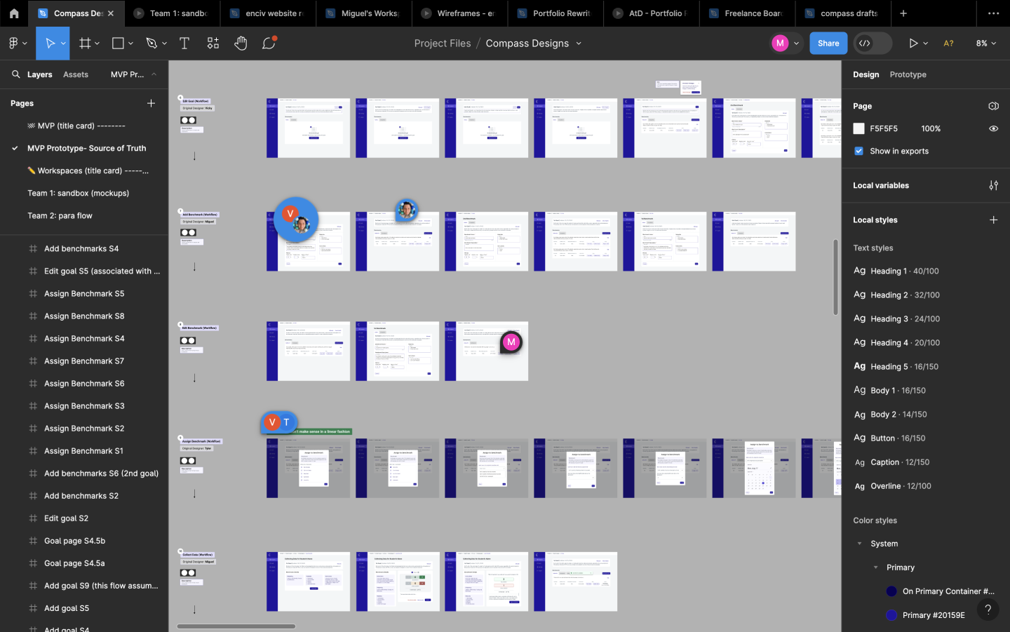
Mood board to help narrow design direction. Took inspiration from various data collection and data visualization tools to construct a cohesive set of insights to direct our design system.
Color System. Designed to consider insights taken from mood board, including the need for a primary color with a non-intrusive, cool hue and a complementary, eye-catching accent color.
Compass Design System. Each element incorporates our foundational style and is outfitted with specs and detailed descriptions on its importance and usage within the product ecosystem.

Wireframes

Journey of low-fidelity wireframes transforming to high-fidelity following user research, design system developments, and matured visual language. My specific focus lied with numerous desktop user flows for Case Managers.
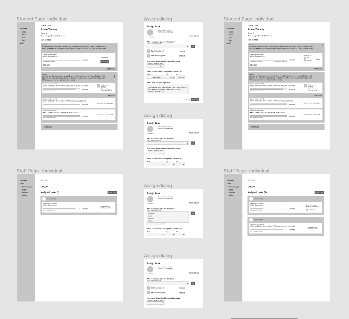
Low-fidelity wireframes. Primary focus lied with establishing user flow and to lay out what components and visual elements needed to be worked on
High-fidelity wireframes. Laid out in vertical and horizontal directions to illustrate user journeys for the different flows. Desktops wireframes focused on the Case Manager perspectives, while mobile ones focused on paraprofessionals.

In Action

The work culminates in a streamlined flow for multiple process related to IEP student data, including its creation, collection, and analysis.

Mockup: Case Manager view of student benchmarks within the classroom environment.
Mockup: A paraprofessional tracking student data on their mobile device.