Access the Data

Removing borders to data access and education

Overview

A Hack for LA project, Access the Data revolutionizes civic engagement by eliminating borders to government data and enabling communities to analyze and benefit from datasets effortlessly.

As a designer, I played a key role in achieving the first MVP and usability testing by creating storyboards, sketches, mockups, and interactive prototypes, while also providing research assistance with the UX team.

Role

UI Designer

UX Researcher

Duration

Aug. 2021 - Jan. 2022

Team

Design: Joanna P. (Lead), Melissa M. (Lead), Andrew S., Kaylena N., Pazau M., Miguel H.

PM: Lucy C., Alyssa B.

UX Research

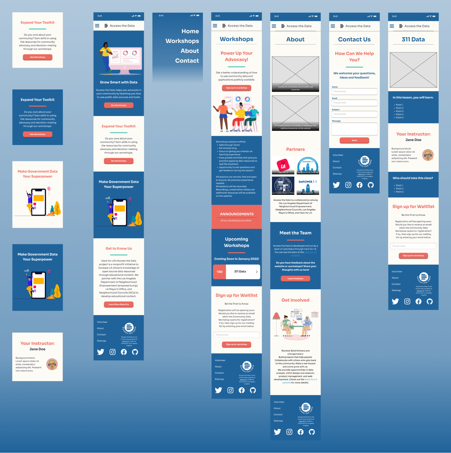
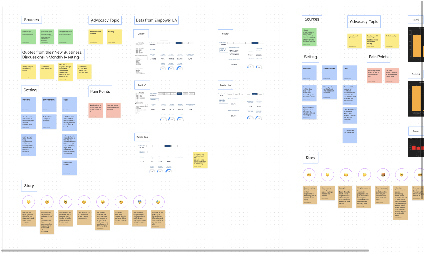
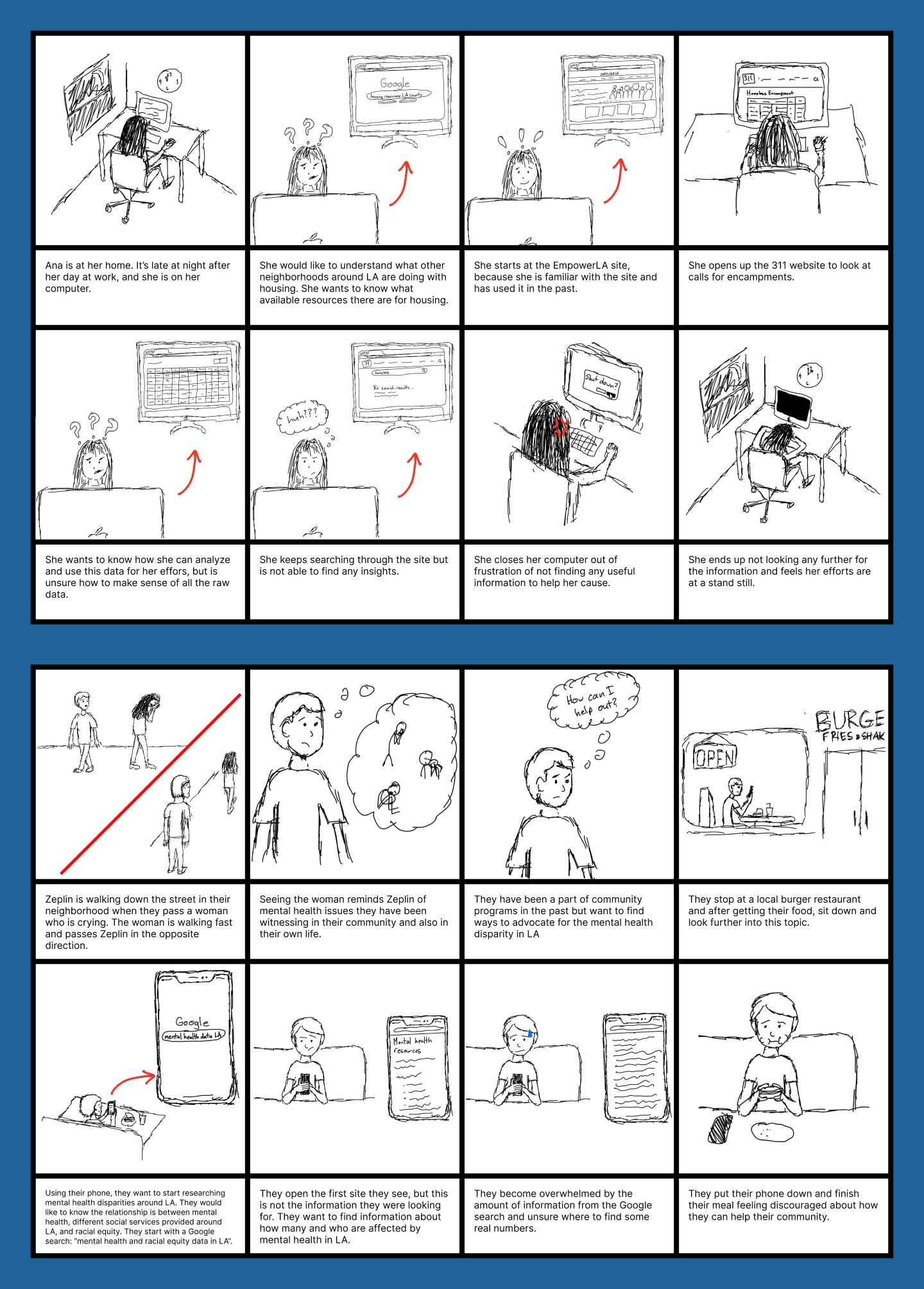
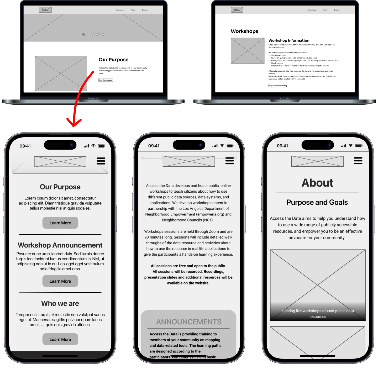
Collaborated with UX team to craft well thought out personas for building and testing our initial designs. My focus throughout the project was to adapt the desktop version of our tool to a mobile experience.
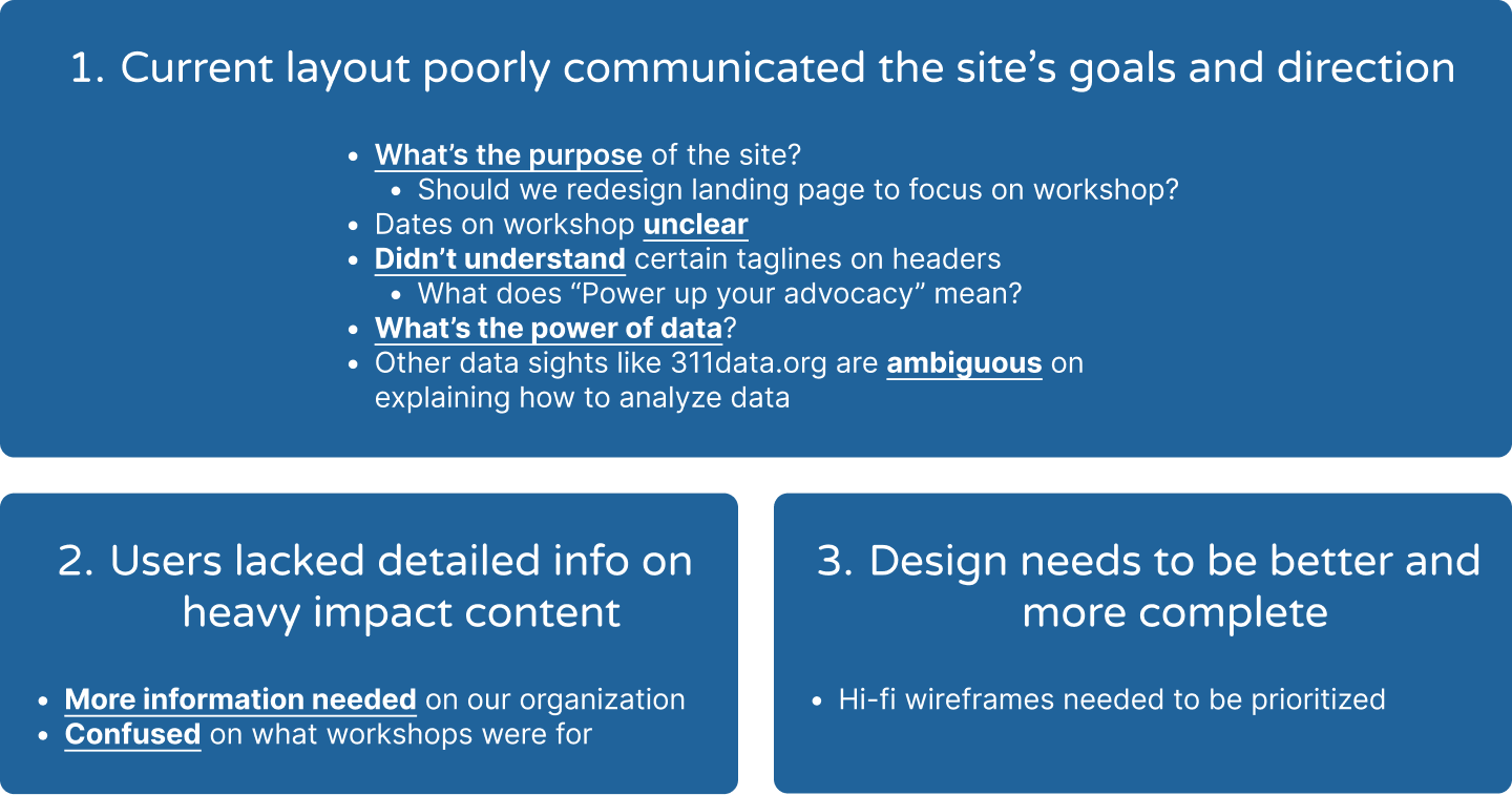
Persona Board. FigJam board to consolidate ideas that help us craft personas for mobile users.
Storyboards. Generated from personas drafting board, I crafted two user journeys that focus on how mobile screens are crucial for overcoming pain points.
Three high-level insights generated from usability testing. These findings highlight the major UX drawbacks that users faced with our mid-fi wireframes.

UX Rework

Updating the user experience to make a more streamlined mobile experience that effectively addresses user’s pain points to allow for an easier way to access data education.
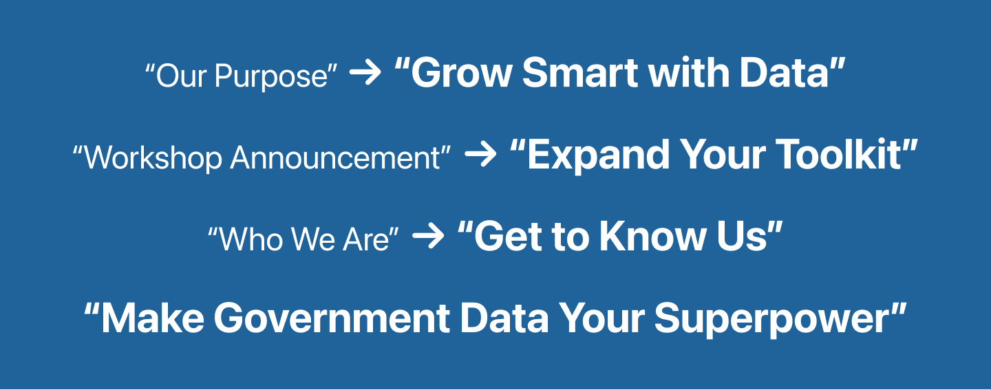
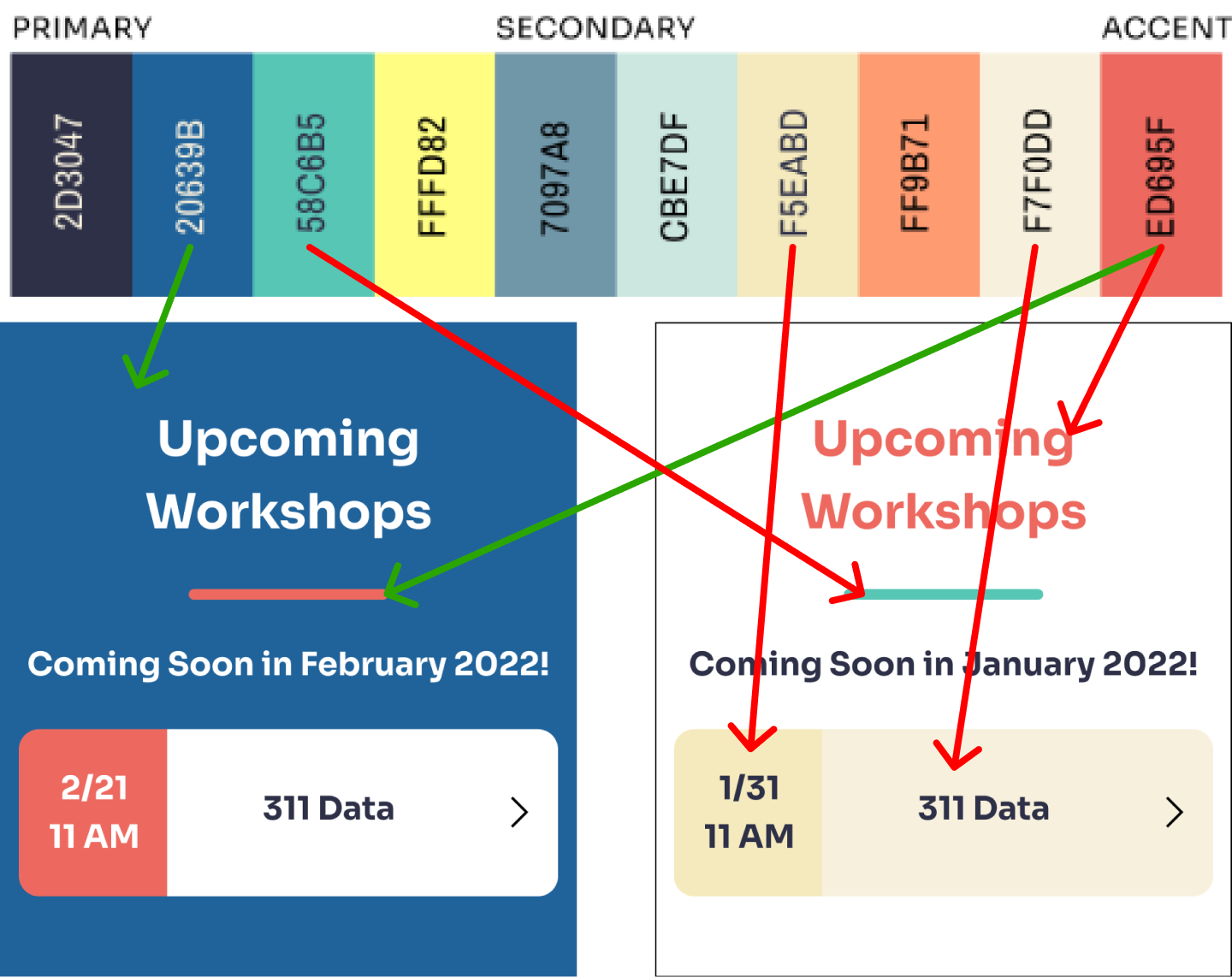
Downsizing UX. Because only desktop screens had been created, mobile wireframes were essential to create following our discovery of the importance of having an on-the-go experience.
Tagline Rework. Creating captivating, actionable taglines to attract and retain users while also maintaining a similar sense of function and importance within the meaning of each header.

UI Design

As the UX was being reworked, we were also in the process of creating a visual language for our designs by adapting color, implementing imagery, and incorporating other visual elements to put everything together.

Color Palette Tests. One cumulative color palette was created, which we used to test two different color combinations through A/B Testing to conclude on the most fitting adaptation. The blue/red combo was the winner as it exuded an orderly and trustworthy vibe for our site.
Final Screens. The accumulation of UX rework, UI design, and overall content creation comes to life on these screens. Some major things to note was sectionalizing content through modular blocks and adding stock visuals to enhance the message and energy of our content.